Logo
The logo is constructed using inspiration and elements of Mexican street typography.
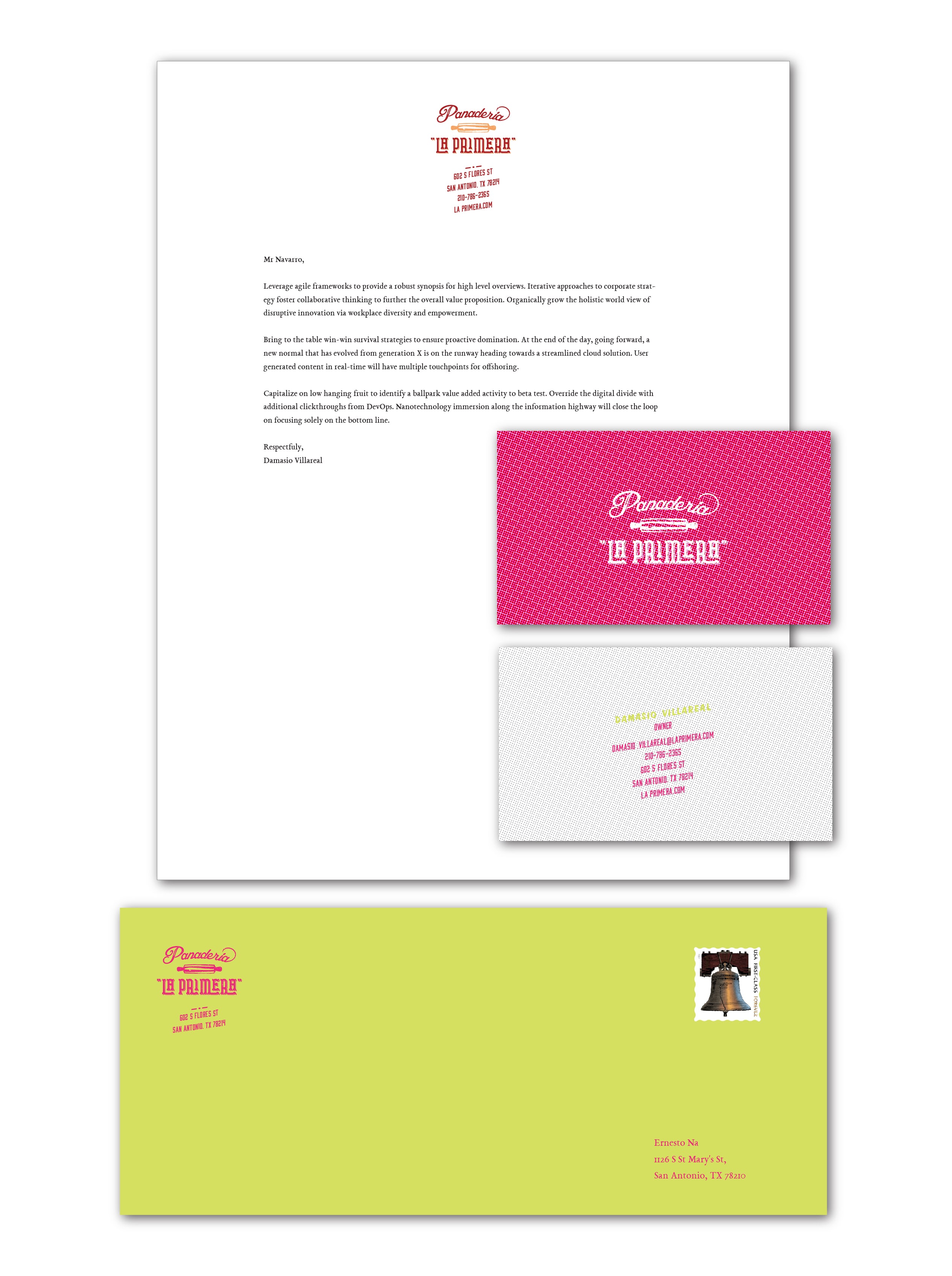
Stationery
The stationery makes use of the vibrant colors used in Mexico’s culture, and incorporates it into the brand.
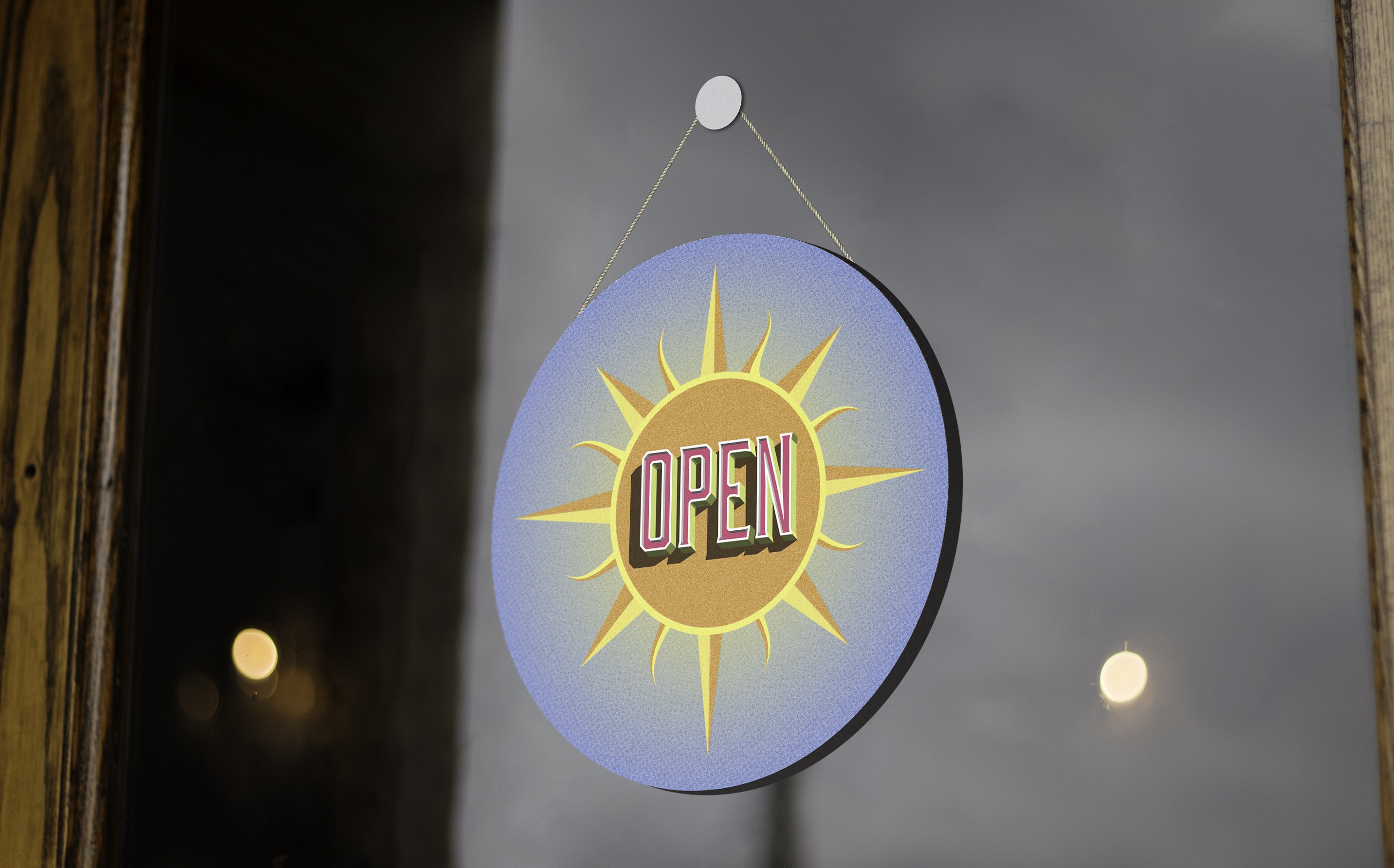
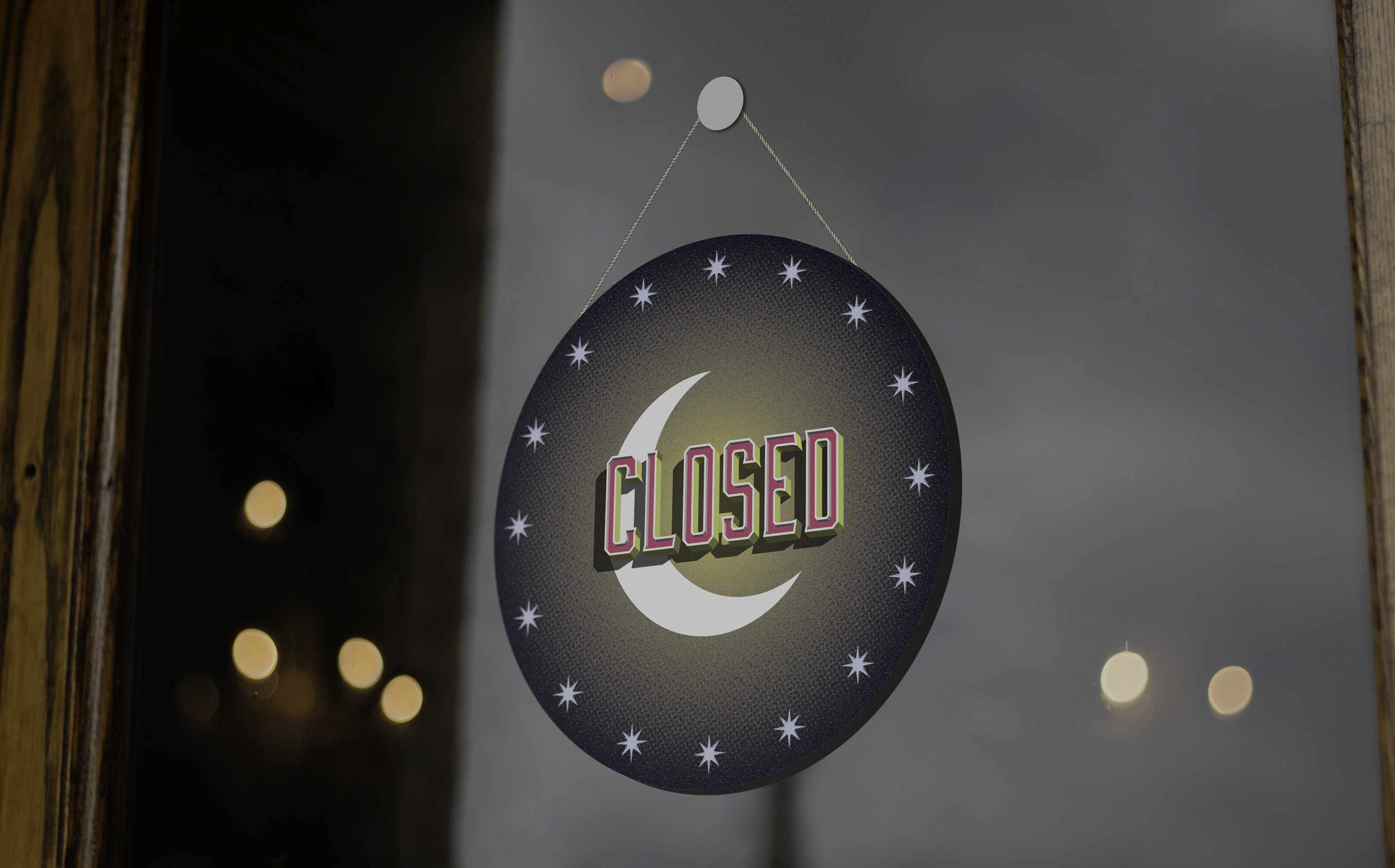
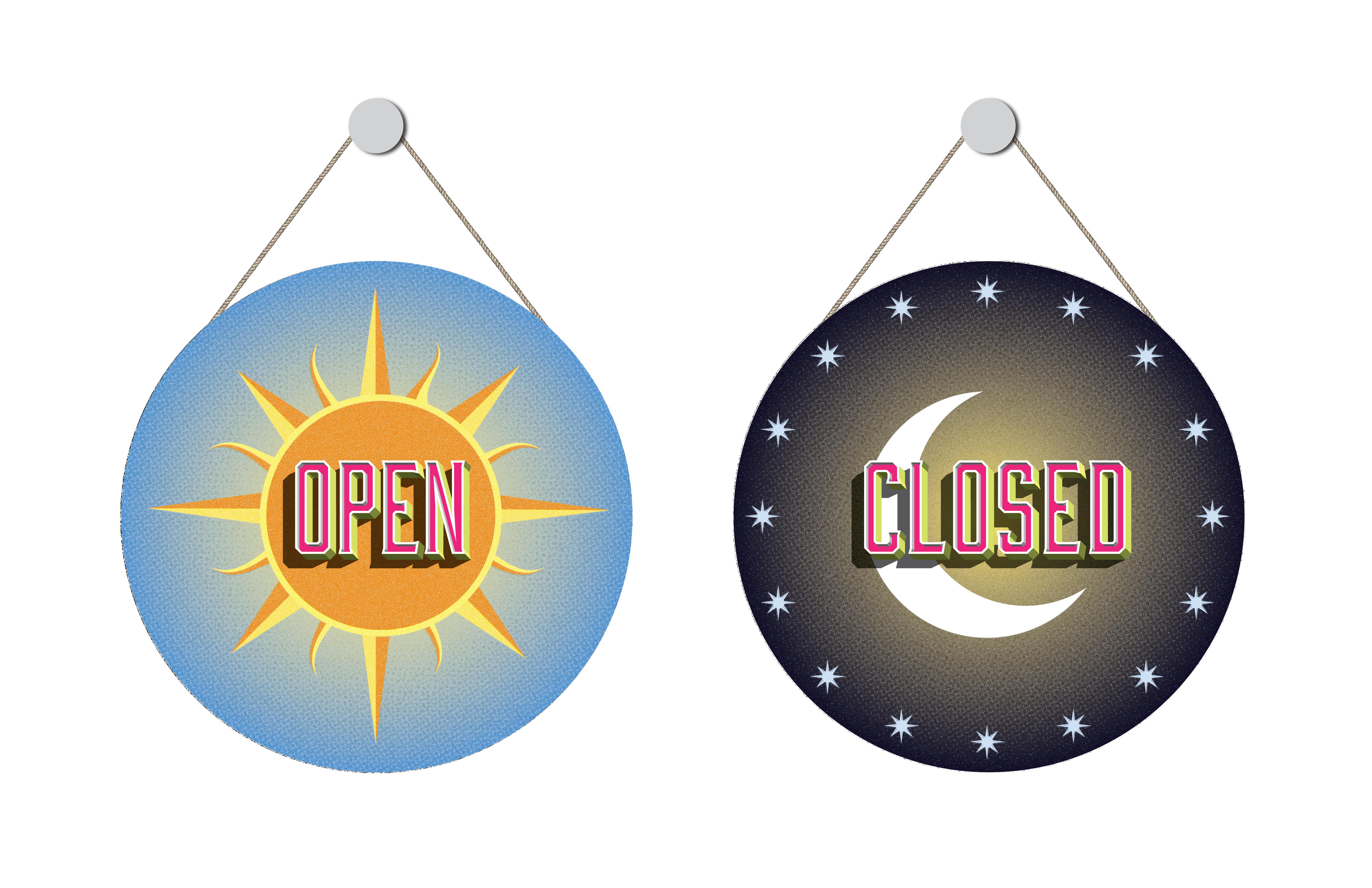
Hanging hours sign
The sun and the moon play a important role in Mexican folk art. An hour sign utilizing these elements adds to the traditional and authentic attributes to the brand.
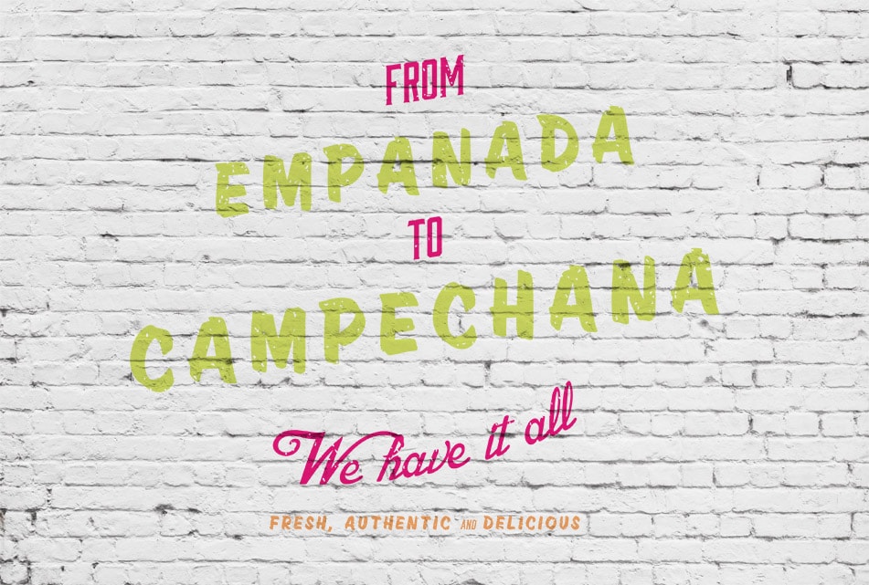
Wall Messaging
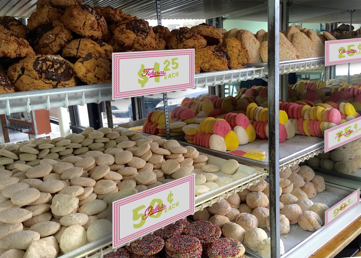
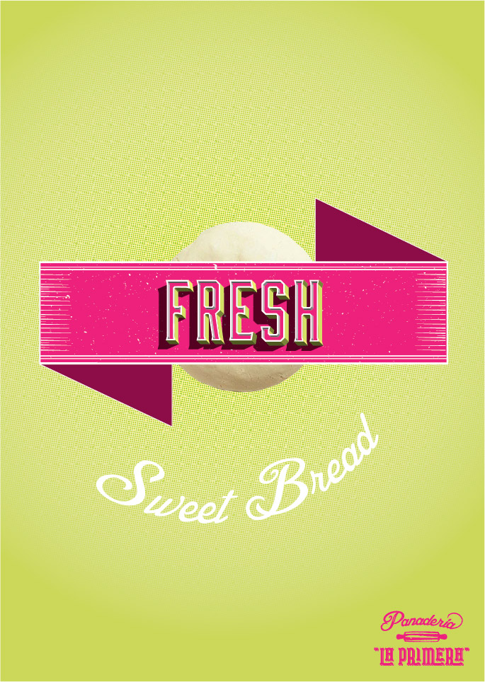
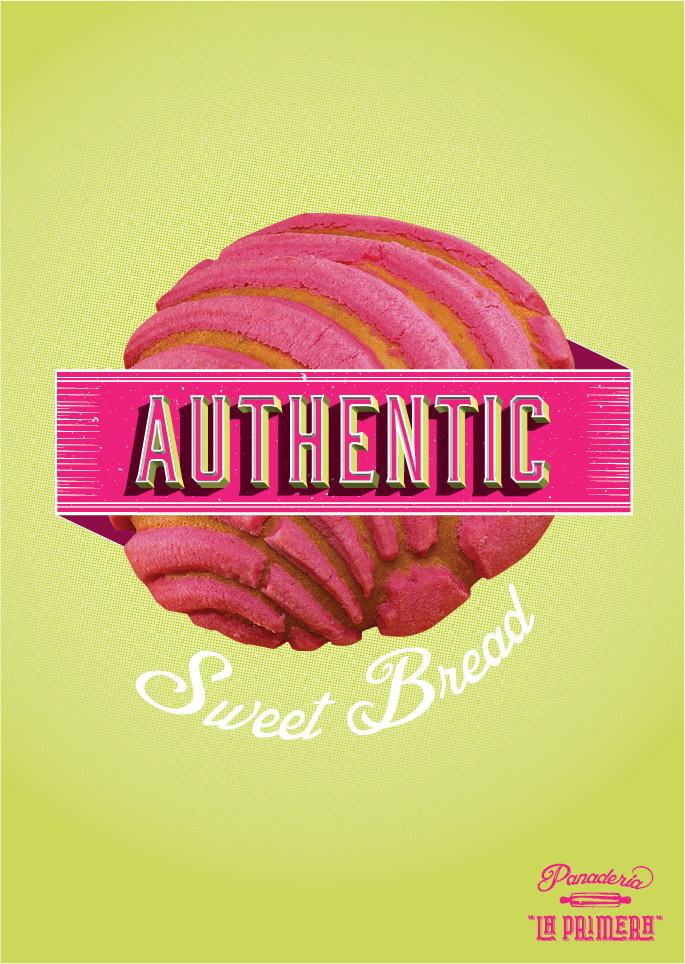
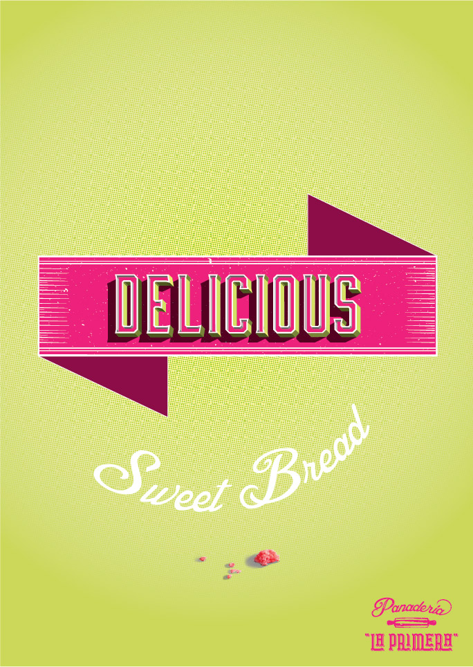
Price Tags
With strong bold typography and vibrant brand color this pieces will make the costumer experience hassle–free.
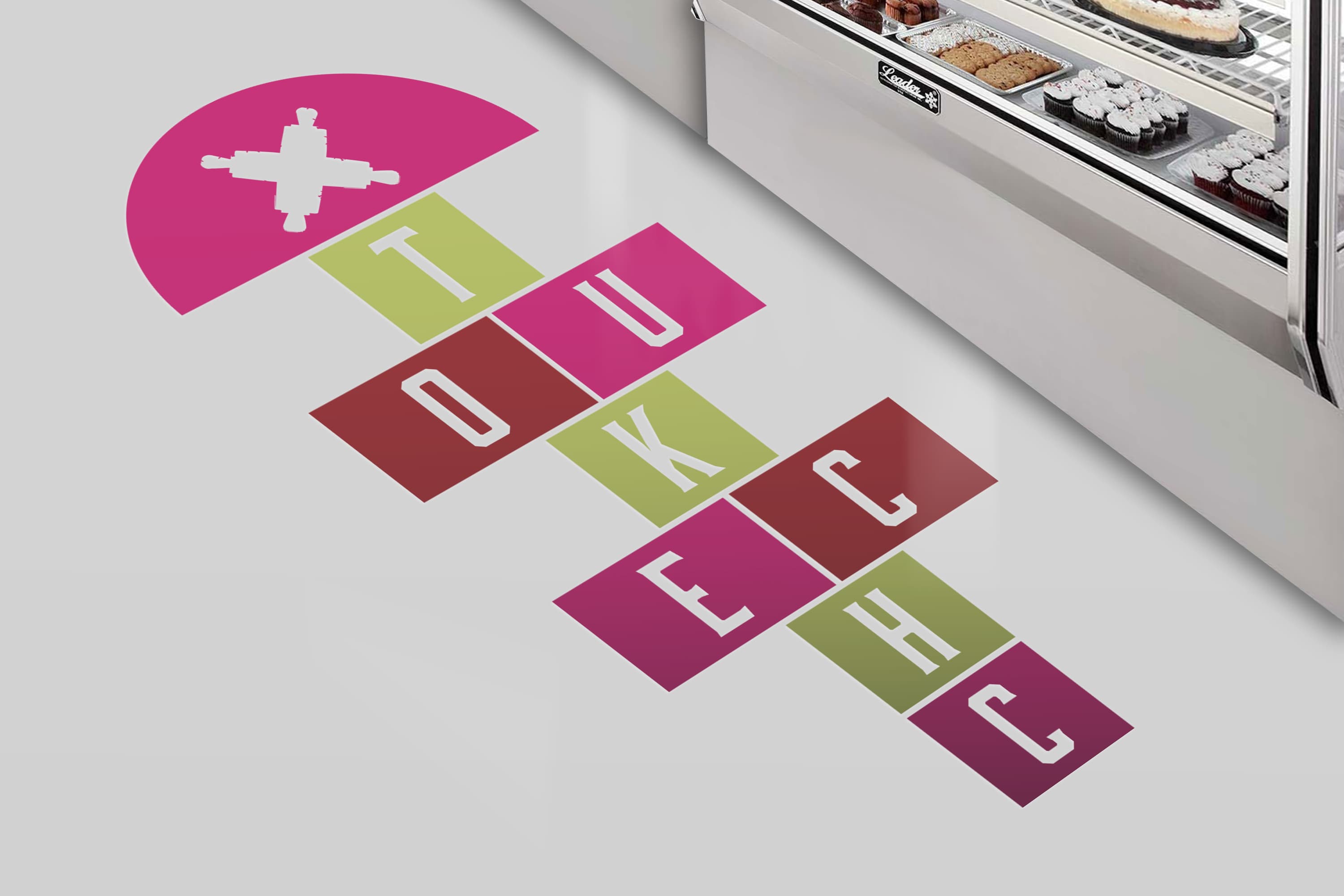
Environmental
As costumers approach the check out counter, they are greeted by a sign that reads “check out” from bottom to top. The sign is made to resemble a Mexican traditional kids game.
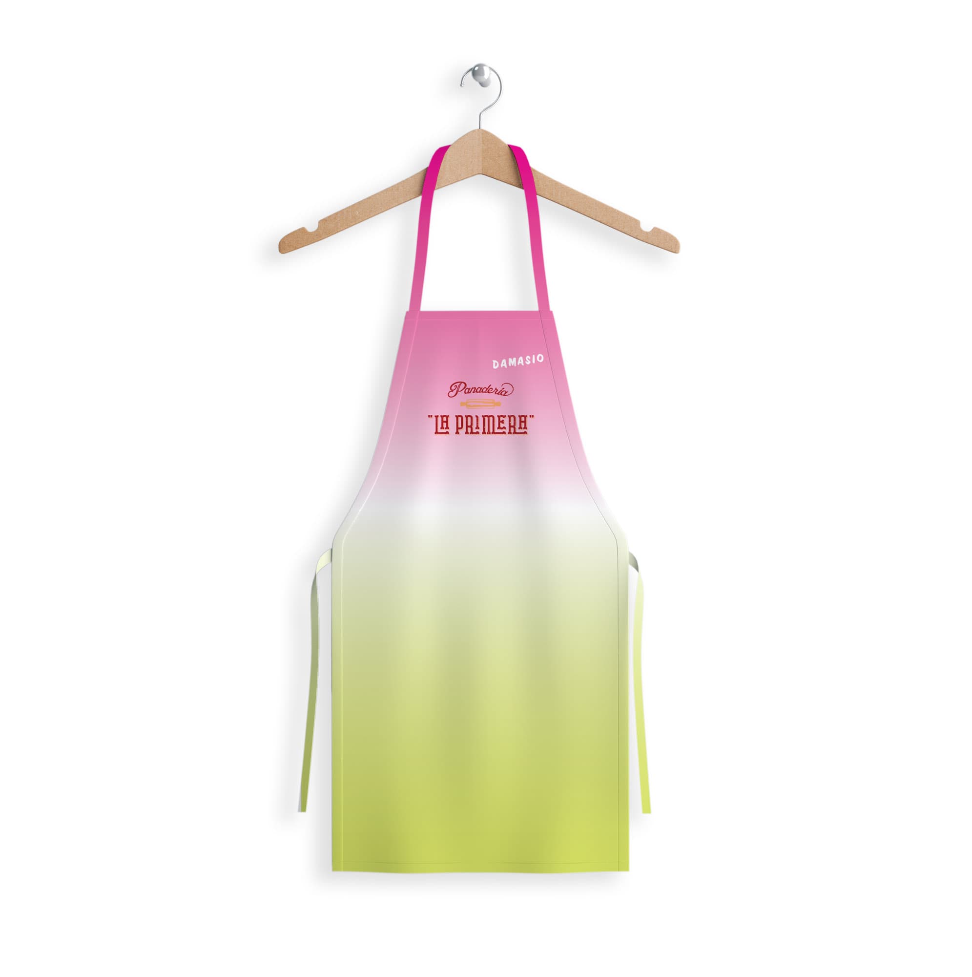
Apron
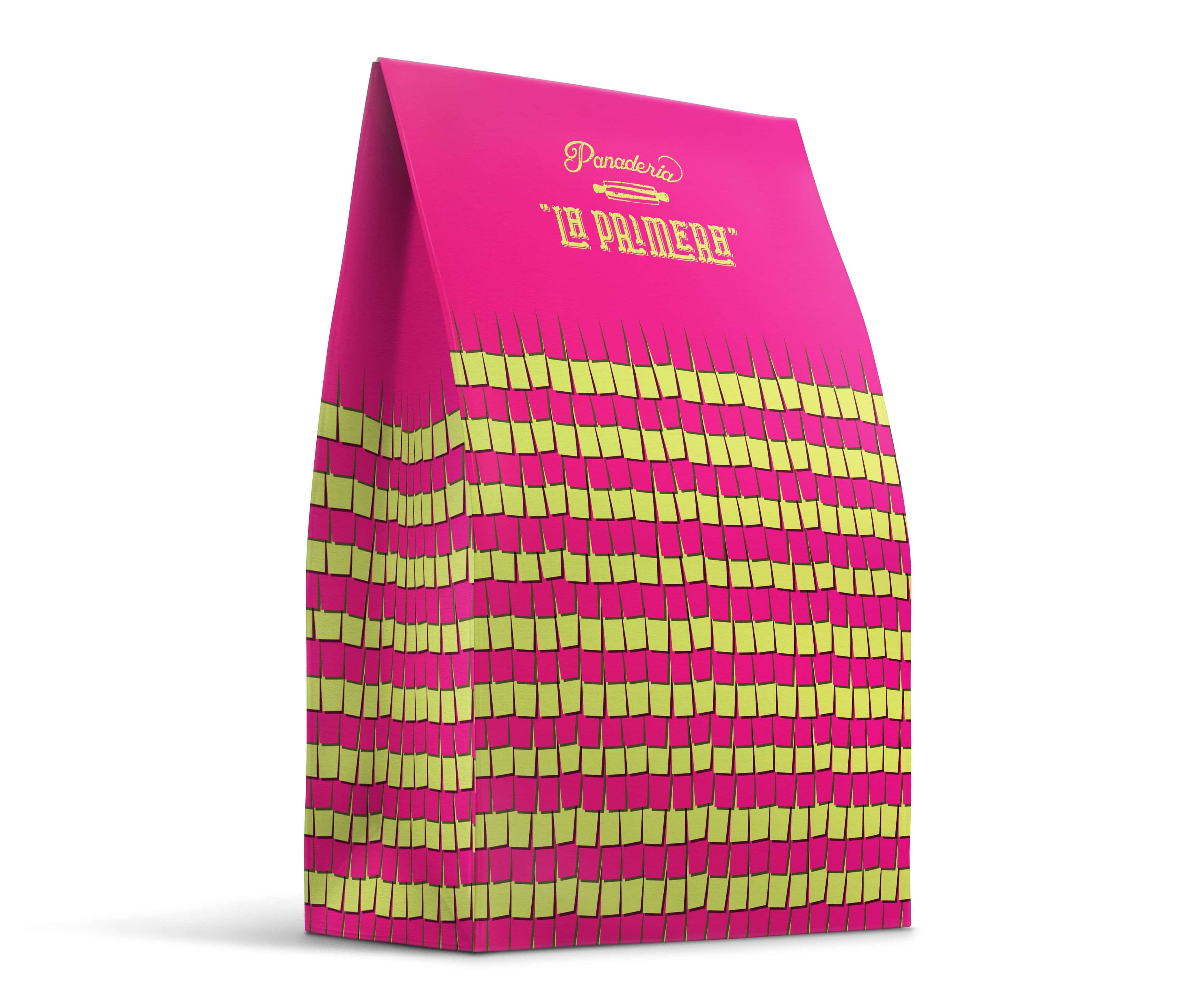
Packaging
This design is used as the everyday bag. The piñata texture is added to highlight how every moment with family is worth celebrating.
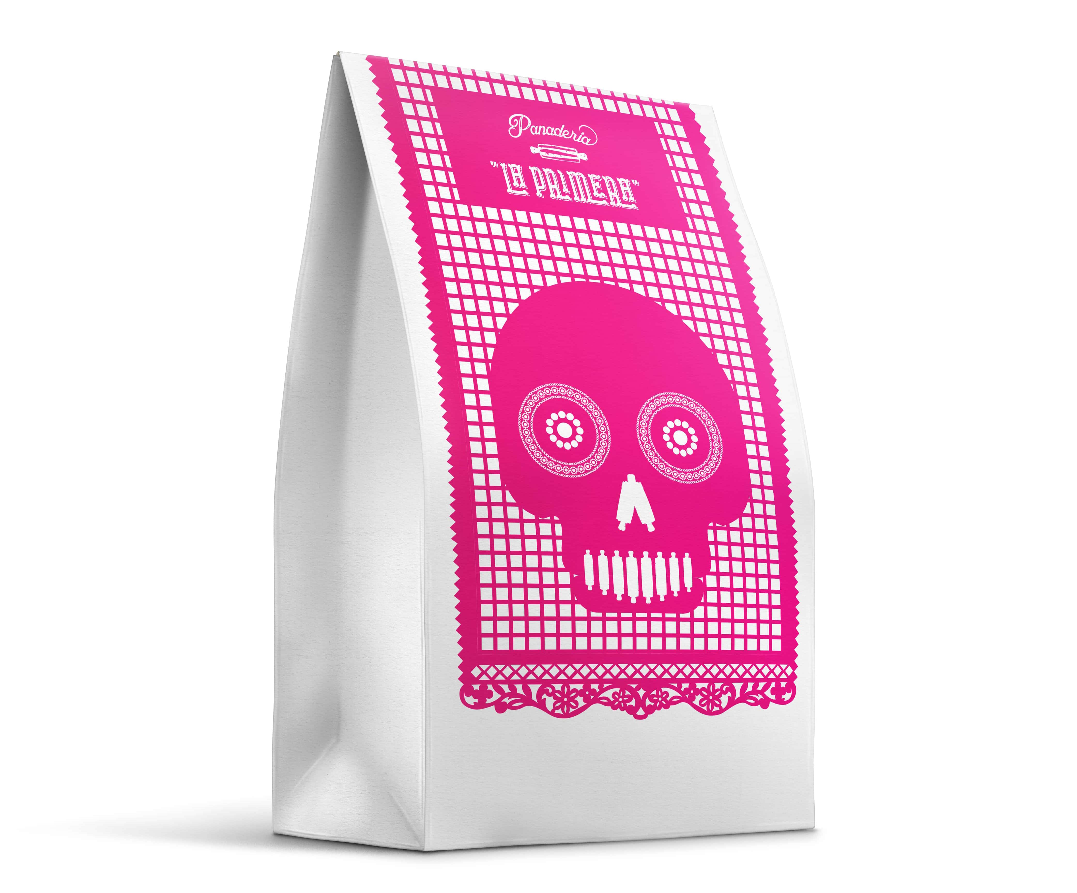
Packaging
Dia de los muertos is an important day of celebration in Mexican culture. Around this celebration there are special breads baked for the occasion. This design is used in early November.
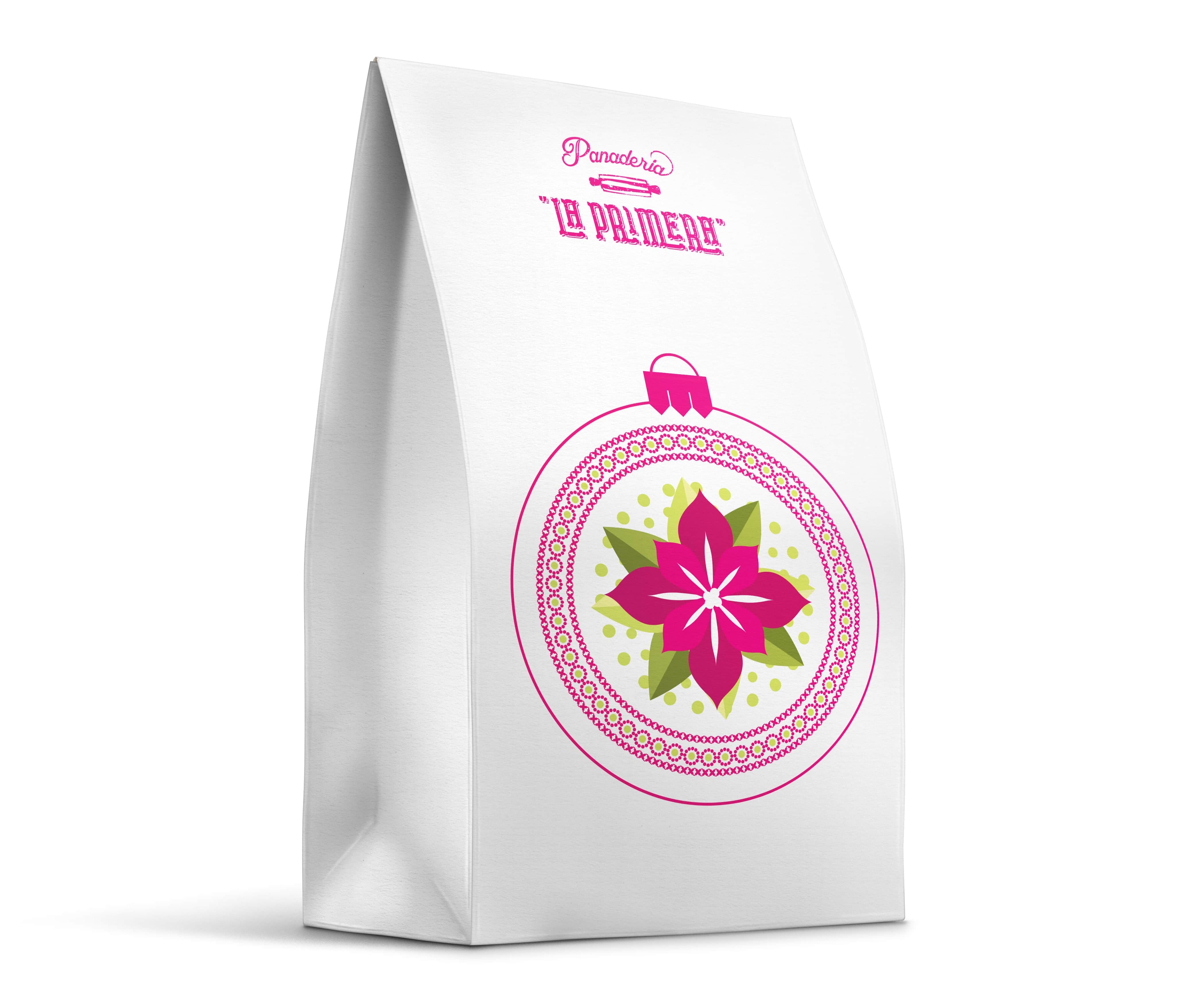
Packaging
“Navidad” is an important day of celebration in Mexican culture. Around this celebration there are special breads baked for the occasion. This design is used around festive seasons to add to the celebration.
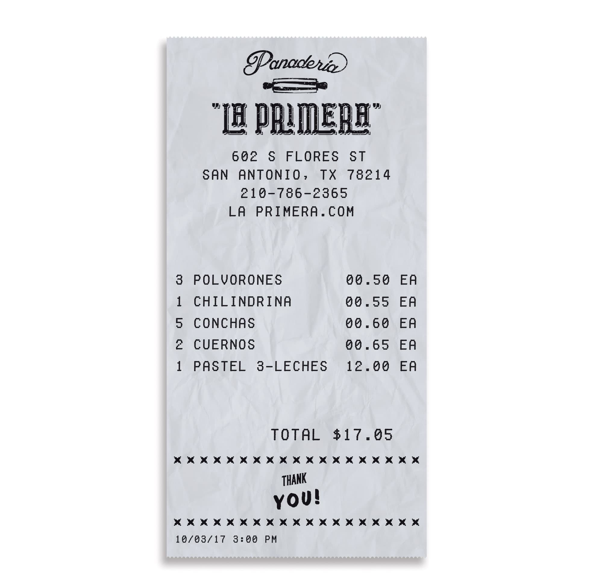
Receipt
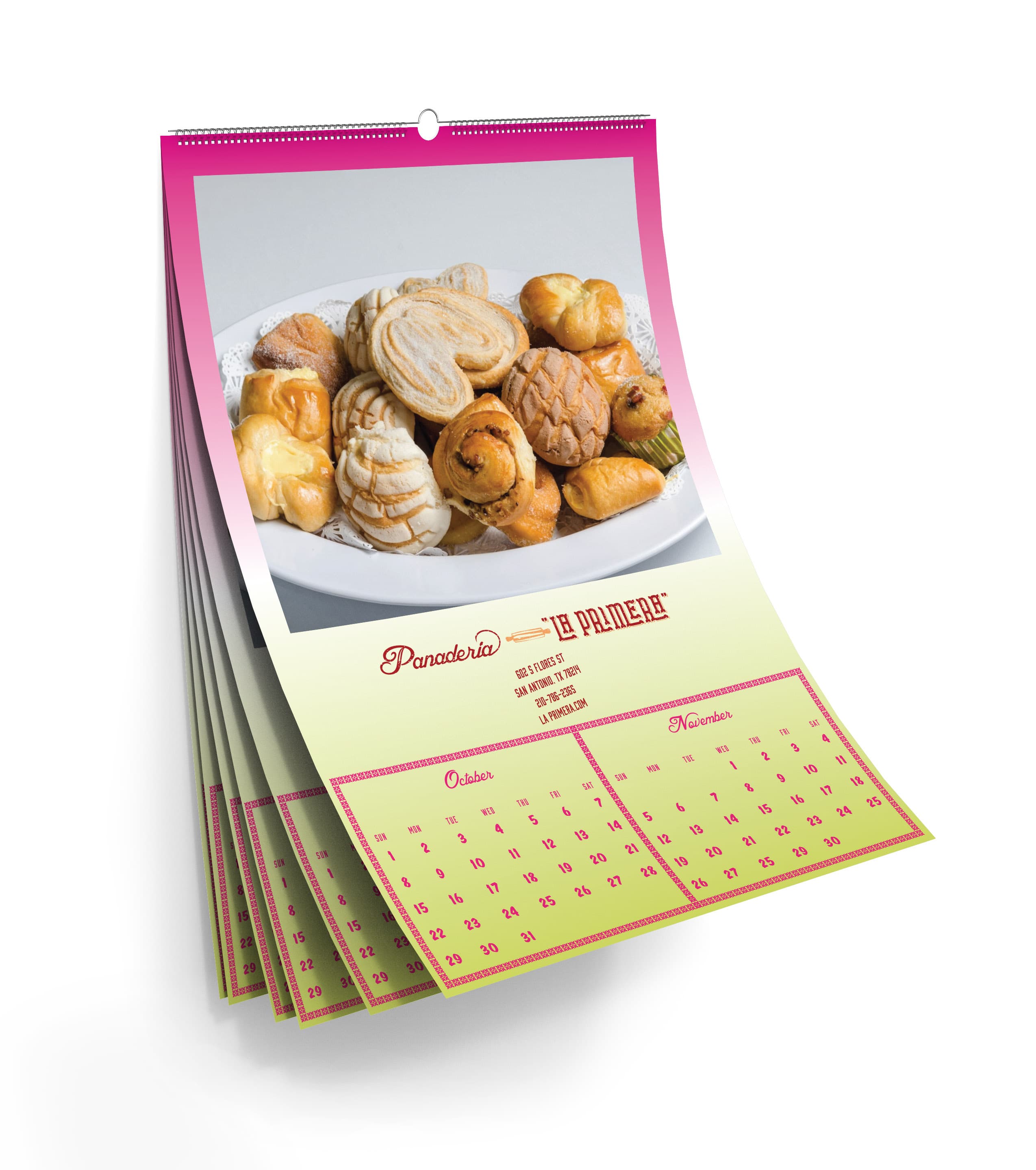
Calendar
Within Mexican culture, local business give away calendars to their costumers to show their appreciation during new years. The calendar is used to continue this tradition.
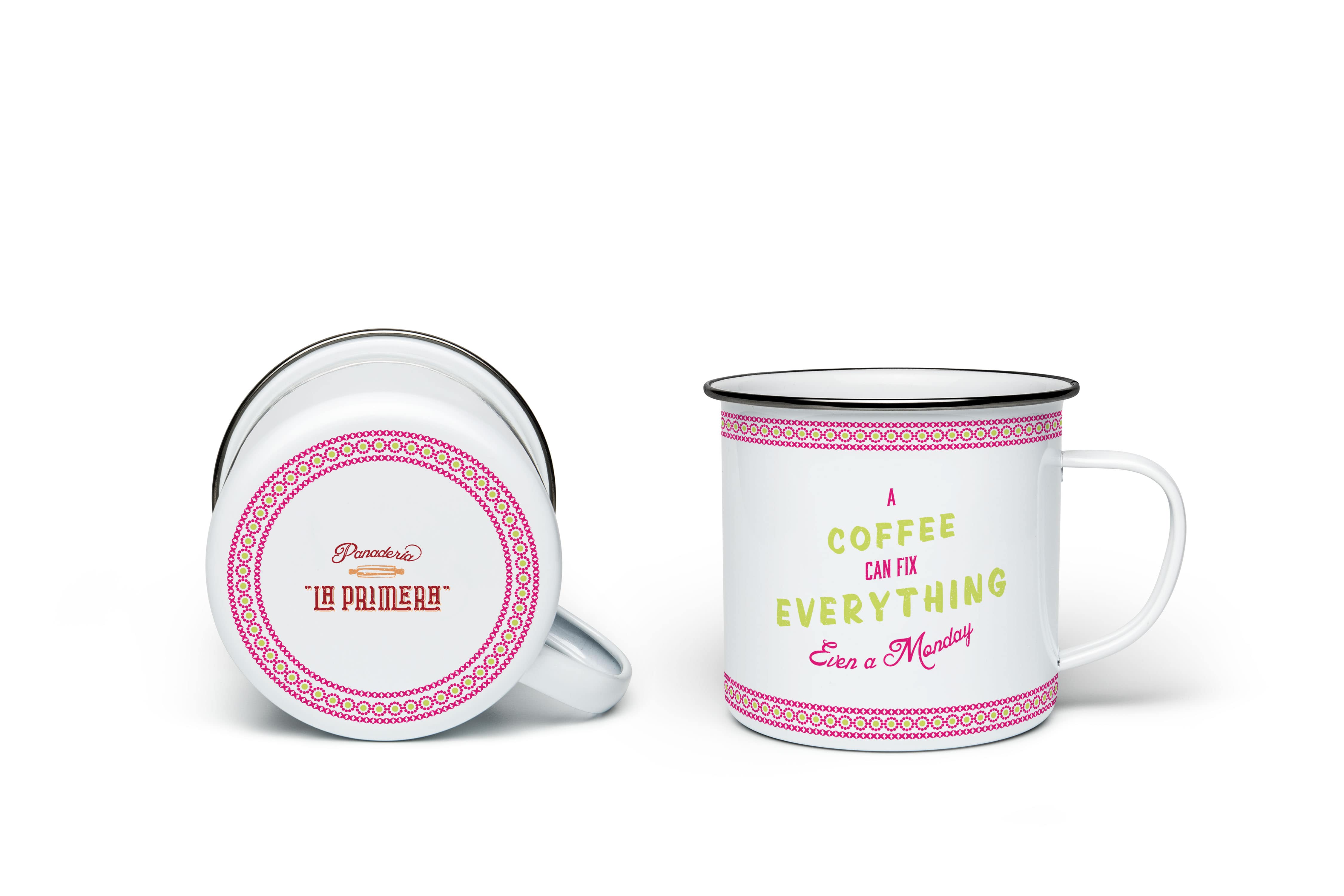
Coffee Mugs
This type of merch pairs well for customers who enjoy a hot cup of “Abuelita’s” hot chocolate with their baked goods.